Wednesday, October 3, 2012

Typography-Matrix look

This is a cool matrix look for the neuromancer book. It is very cyber space looking.

Monday, October 1, 2012

Graphic Design-examples of design

This is a good example of how business cards, letterheads and envelopes should look.

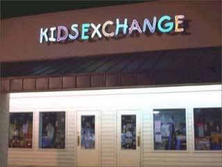
Graphic Design-Kids Exchange

This company was not thinking when they made there Company name. the spacing in their store name was not to well thought out.

Graphic Design-busy business card

This business card is a little to busy for one's eye. They should have implied a little more so people could easily look at it and get the quick info they need.

Typography-fantasy book

I love the font of this book. I can easily tell it is a fantasy book.

Typography-interesting Book Cover

I actually really like this book cover. The colors used really captures my eye and i find it visually interesting. The bright yellow color allows me to recognize the title of the book easily and to understand what it is about...But also, the words draw your eyes to the right side of the page and off the cover, which is not a good thing.

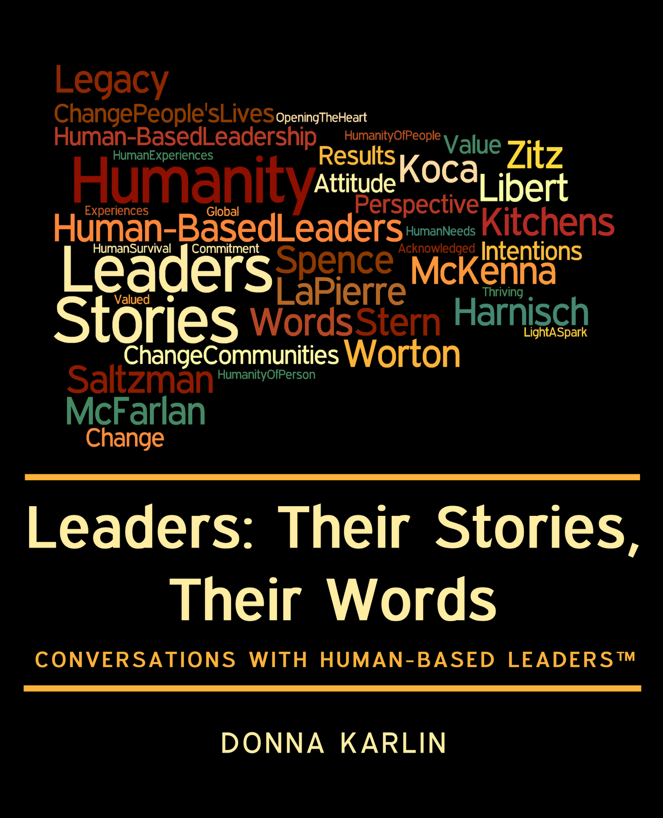
Typography-book cover

This book cover is visually interesting, but your eye is drawn to so many different fonts. This idea of a book cover is also used within many other book covers, so to me it is not as original.