Thursday, November 29, 2012

Graphic Design-EMS folder

This business folder is pretty nice. but at the same time it is really flashy. The inside might have to many pictures. It could be entertaining for someone but it could also be very overwhelming. The front of the folder seems to have a text running along the back of EMS in a gray color. It is a little triply for the eye but at the same time it gives it more texture. I believe there are simple adjustment that could be done to this piece.

Graphic design-Travel Africa

These travel flyers work really well. The colored blobs go awesome with the picture and tag in well with the areas the person is going to go visit. The text works well...It can be a little hard to read at times, so maybe I would change the font if it came down to it, but overall they are pretty nice flyers and I like the flow they have.

Graphic Design-3D luminescent

This is a pretty cool looking 3D effect piece of art work. I love how the bright lights actually look like real lights and have that luminescent glow to them. It had great dimension and perspective. The colors are really cool and it was done with great persistence. I like it a lot

Graphic Design-Peacock

This is a super cool peacock, I can't even think to where to begin with this. The colors they chose are amazing and so vibrant. It must have taken hours on perfecting this piece. Each individual circle and shape. It shows that a very steady and masterful hand completed this piece of art.

Tuesday, November 27, 2012

Graphic Design-Amazing face

This illustration is beautiful. The way they did it make it look so shiny and so realist. How can someone be that good on the computer to make it look this amazing. This really inspires me to do something amazon in my class, but with my inability to use the computer to work at any time I want to doesn't help. The shading is also done amazingly. I love it.

Graphic-Live letter

I love how the photoshopped the text onto this persons body. It gives this piece of information whether it be a flyer or some sort of pamphlet. The way the text is coming out of the letter and hugging her is such a great idea. It goes along perfectly with the message and I think this is an awesome piece.

Graphic Design-Earl

This is such a cute illustration. I could definitely see this character being in a children's book. Growing up I really wanted to be a children's book illustrator. I would love to make images like this on the computer. I love drawing cartoons. If I could just master the pen tool I would be doing stuff like this a lot. It would take much practice but Id get there. The man who did this is very very good!

Graphic Design-Monkey?

If this is a monkey it is awesome! I get so jealous seeing the way people form their images using adobe illustrator i think. It is so clean looking and even. The piece is so easy to be predicted. I struggle enough with making curvy lines with the pen tool. I love how they did the fir and gave the animal such an angry face using only negative space. It is cool

Typography-Tank

This is an awesome 3D piece of art using only type to form an image. a pretty spooky one if you ask me. The words in this piece describe financial problems and the fight we are going through in them. That is my guess, but it is very neat to see how the words from a feeling for the viewer. A very empty yet scary picture.

Typography-holding hands

This is so beautifully done and the theme behind it is awesome. The red hand signifies someone struggling who really needs a friend to help them. The black one it the one grabbing the friends hand and pushing them through their struggles. I LOVE that you can figure all this out by reading the texting with the arms. I like how they did the shading by layering the letters. It worked very well. This is a very neat piece of work and I like it a lot

Typography-Black insides

I love the dark inside for this menu. The menu I am doing has an all black front and cover with white text. But on the inside I am doing white with accents of the black. It is really cool to see a menu with all black on the inside. Im not sure you really se them often but I believe it helps catch the attention from the audience. I like it a lot.

Typography-fancy

Once again I like how they did the 3 different type variations. One complaint would me that the over main dish such as appetizer and soup is a little hard to read because of the italics. I believe if they chose a different font it would have been better. Script font is always much harder to read. I understand it is fancy but I believe you can find fancy in other fonts as well.

Typography-Font variation in menu

I love how there are 3 variations on the inside of the menu. Maybe Ill consider that when working on mine.  I like how the main things such as "drinks" "appetizers" "Entrees", they each have a certain font, and then the actual appetizer is a different font with the text describing the food under it in a different variation of font.

Typography-Zebra

I Love how the incorporated the words zebra in made different shapes and sizes and so many different variations in color as well to form a Zebra out of type. I have seen this done a lot and I know it has got to be so hard. I am almost to scared to try it, But I would feel awesome after finishing it. I give th eperson who did this props because they even got the shading right. EVEN IN THE EYEBALL! amazing

Typography-Beautiful work

This is so beautiful! who ever crafted this typography is amazing. They worked it so elegantly and with such beautiful colors. the shading is amazing and really give the type a rounder feeling. All the colors help with that as well. I love all the curves in the letters and how pretty it looks. I am pretty sure it says bad romance.

Monday, November 26, 2012

Graphic Design-Flyer

This Flyer is way to much! there is so much going on in this peice. The colors to me dont work together to well and the font isnt the best. I beleive they could have put a little bit more time into the peice and made it much more awesome. They could pick an awesome color scheme and a way better font.

Graphic Design-Horse Wave

The graphics on this is very cool. I love how the horses and the waves are incorporated. It is very beautifully done and so clean looking. When I do graphics sometimes it is so horrible and messy, this is so pretty. the colors work great too. All the different shades mix well together to make this graphic completely awesome.

Typography-Kerning matters

Kerning issues are a problem in all graphic designs. When the spacing is not worked out correctly, It ends up looking like this and causing alot of problems. It is very bad when people dont look over the spacing in the words of this building. It is mistaken for something really bad. hahaha

Graphic Design-Mess Up

How can a company screw up this much! It is embaressing to see this on a business door. IT makes them look so much more unprofessional. The graphic could be so much better if they focused more on the image thinking outside of the box.

Graphic Design-Suit Yourself

Graphics can go wrong in so many different ways. When a person first see's this picture they read it completely wrong. It is supposed to say suit yourself but obviously comes off differently. It is funny but it can get the person advertising the picture in big trouble. You should always double check everything before publishing out to the public

Graphic Design-woman spraying dog

This ad is very funny. I love how they incorporated the dog into her hand to where it looks like the the dog is almost sneezes on the woman. The graphics look pretty well. It looks almost like she was really holding onto the dog and spraying herself

Typography-bad water bottle label

The font of these water bottle labels are very childish looking. the font chosen reminds me of little kids and I feel like if you are getting married, you would want a more mature font on your water bottle labels

Typography-wedding labels

I do NOT like these wedding water bottles. First of all I feel like the colors are very kiddish and I understand that is probably what the bride wanted but it makes me personally think it is ugly. there is so much swirly graphics and script font. It is almost too much to take in by looking at it.

Typography-clustered

I like theme behind the spacing in this question, because the font is really crowded just like some peoples office spaces. It is cluttered and hard to read which works well because a desk can be very cluttered and so is this ad.

Typography-Kerning Matters

This shirt is awesome. I like how it explains how it says "Kerning matters" and it makes it look like Keming. It nreally shows the importanc of kerning correctly. and spacing things out properly.

Typography-EMPLOYEE

This picture shows bad typography because Employee is split up onto three seperate lines. It makes the audience struggle more when reading the sign. A signh like that should be simple and very readable so people get the message across and understand it quickly with no struggle

Saturday, November 24, 2012

Typography-Ipad mini vs. Surface

This is something I noticed driving home the other day on billboards, but the Surface is pretty mch the same font as the iPad mini. I am proud of microsoft for wanting to step up their game and beat out apple, but I believe they should have chosen font not as similar to Apple's font. Thats just my opinion though. haha

Graphic Design-People on folders

I DO not like when photographs are on the folder. I believe the folder should be much more simpler by sticking the a color scheme and branding of the logo. Having photos personalizes it, and I feel like it should direct itself to a more broad audience

Graphic Design-Herofilm folder

This is a pretty cool folder. I like the dark background a lot and the font for the company. The inside is don't very nicely with the information on the left inside flap. The gray and navy blue look very classy as well. The business looks very professional because of the fonts and colors they have chosen

Graphic Design-Spotlight folder

This folder caught my attention. I love th purple and black color scheme and how the "spotlight" in the folder goes perfectly with the name of the company. It looks great and very professional. I like how the folder has a diagonal on the inside starting from the top going downwards from right to left. Looks very good.

Graphic Design-Business Folder

This is a crazy business folder and would cost sooo much money to get a lot of these made. It is really cool though that the shape of the folder resembles the logo for the company and how all the colors tie in so nicely. and also how the curves holding the cd in place is always used in the logo. The designer did a wonderful job, It is just probably really expensive

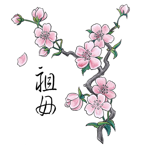
Graphic Design-shaded cherry blossom

I like this illustration of the cherry blossom. They did a wonderful job in the shading of each petal and on the branches and leaves. I wish I could accomplish something like this but it would take to long and I don't have enough time to perfect my folder with the proper shading

Typography-Kanai

This font is exactly what I was talking bout earlier. I love the font so much. You look at it and immediately know it will be a classy restaurant with really good food. At least that is what our expectations are when seeing this building.

Typography-PF Changs

I like P.F. Chang's font a lot. The architecture of the building goes great with the font as well. You know its some some fast food china bistro when you look at it and that you think you at least be getting food worth your dollar.

Typography-Resselle

I LOVE this font. It is so classy looking. If I saw this font on a menu I would immediately know it was a more high-class restaurant. The skinny letters and sans serif font work great together.

Typography-Soup Menu

This menu looks good with the green and light green background and the yellow bubble letter font. I fee as though when you first see this menu you immediately understand its for either soup or salads, anymore on the lunch menu side. It works well.

Typography-menu

This menu has a good color choice but I don't like the random pictures of the food on the menu. It makes look a lot less classy than what it is. Also the front of the menu has so much graphics is confuses your eye and I believe they could've have chosen a much better font on the front of the menu.

Monday, November 19, 2012

Graphic Design-Japan delight flyer

This is a nice Japanese flyer used to tell people about the restaurant Japan delight. It is simple and it lets you know it is a Sushi restaurant as well. I like the colors for it and it lets people know it is a more classier restaurant flyer.

typography-Classy Menu

this is a really cool menu cover. Its very old looking and it would work good with a nice fancy restaurant that has older elements in it. I find it very pleasing to look at and I like the dark burgundy color and the gold tyext. I believe it all works well together.

Graphic Design-Pink Cherry Blossom Tree

This is a pretty nice cherry blossom tree that has nice curves and that is something i want to be able to do in my cherry blossom illustration. I dont really like the pink trunk of this. I believe another color would of been better int eh making of this tree

Typography-Ripe Tomato Cafe

This is a fun and simple type of menu. The font is more playful for the people. It has a simple graphic element in the top right corner but its not so much that your eye is so drawn to it. I like how the text size varies and how the price matches the name of the food.

Typography-Simple graphic Elements

Things like this are very simple design elements I could use in my black and white menu. I could do a simple illustration of a chef or of a specific food. It wont be too much that the person is sooo draw the the image but enough to give the menu a more aesthetically pleasing image.

Typography-Texas Roadhouse menu

This is a little blurry but the texas roadhouse menu usually really catches a persons eye. The colors used in the menu work nicely together and they really emphasize that it is a roadhouse. The way they separated each item is nicely done with the darker tan boxes saying what food group a person is looking at.

Saturday, November 17, 2012

Graphic Design-Tree

Making a tree like this in Illustrator is what I want to do for my cherry Blossom except make the tree much thicker than this one and having more branches on it. I just need to learn how to make it so elegant looking and cleaning with no rigid edges.

Graphic Design-Cherry Blossom Elegance

I love the elegance in this cheery blossom branch. I need to learn how to make the tree on my folder I am making more elegant like this cherry blossom branch.

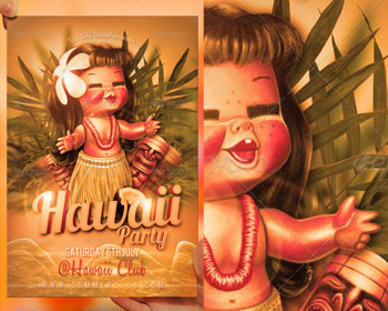
Graphic Design-Hawaii Flyer

I love this flyer! it is very cute and shows you what Hawaii is like in its font and in the graphic of the hawaiian girl. It is very cute and It drew my attention right away. I would definitely be interested in looking at this flyer if someone handed it to me.

Typography-Wedding Menu

This Black and White wedding menu is very elegant and formal looking which is great for the occasion. I like the scrypt font emphasizing the dinners. Then Underneath that is a nice font to let you know what is being served and it is very organized looking. In the bottom right corner is a simple graphic element of a cake used int he menu. I like that. It makes it less boring

Typography-Big Font Menu

I like how this menu has a certain style to it. The font choice makes the menu look a little older than what it is. The text is very large and very easy to read which is always nice since the audience for food ranges quite drastically.

Typography-menu

Although this menu is readable. It is not very appealing to the eyes. It looks like it was put together very quickly and It almost gives me the feeling that the food is cheap and dirty, just because the menu is cheap looking and almost dirty looking as well. A lot of work could be done to this menu.

Thursday, November 15, 2012

Graphic Design-Generalize folder

This Is a cool folder. I like the bubble effect but I am not a huge fan of the people's faces on the side. To me the folder should be presented for a general audience but with the faces on the cover it personalizes it a little to much. But I really like how the brought the circle in the logo and enlarged them in the lower right hand corner.